First impressions are everything, as they say, and this rings true for everything from job interviews to meeting the boyfriend’s parents for the first time- gulp! Your wedding invitations give your guests a first glimpse of the style and tone of your special day. When opening the invite, you want your friends and family to envision the big day that you are working so hard to make memorable. To make this happen, you’ll want to find someone who can create a custom suite for you that matches your vision and theme. Luckily, finding that talent isn’t hard with so many talented stationery designers right here in the GTA!
To help those of you in the midst of planning your wedding, we reached out to 14 Toronto stationery designers to share their favourite invitation designs from the 2017 wedding season with us! Take notes and happy planning!
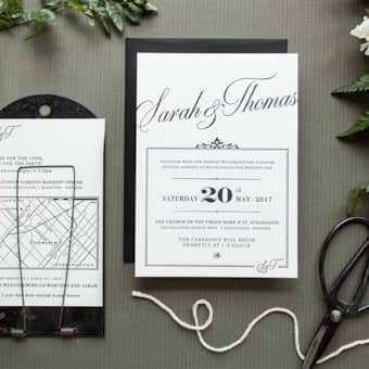
Lovely Little Design Co.
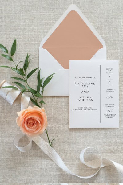
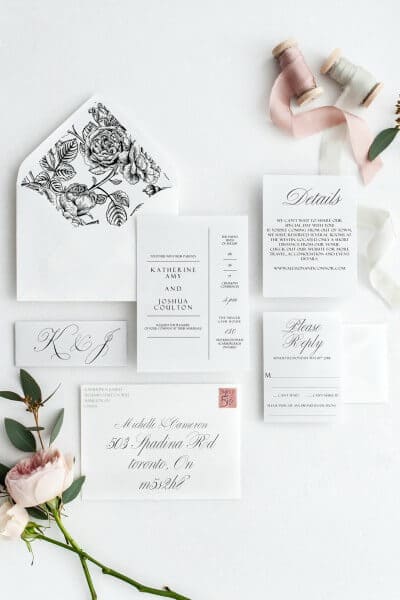
“My favourite style this year is simple black and white with beautiful typography and a little geometric charm. I’ve strayed from my signature watercolour and floral designs because I have found that with a simple design, couples can add their own personality into the details like envelope liners, and add more graphic elements to their day-of stationery.”
– Alex Jones, Lovely Little Design Co.
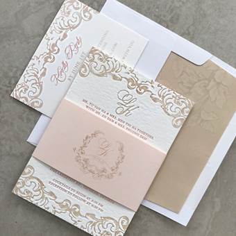
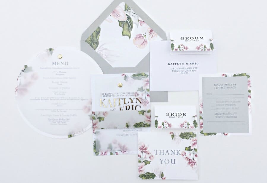
Ivorie Paperie
“Ivorie Paperie’s favourite wedding suite from 2017 is all about contrast. Soft tones of gray and blush with bold foilage. Vellum overlay and striking gold foil. We absolutely love mixing materials and prints to create something truly bespoke!”
– Carol Lam, Ivorie Paperie
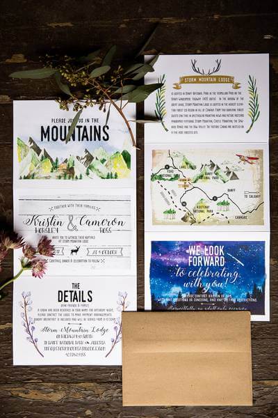
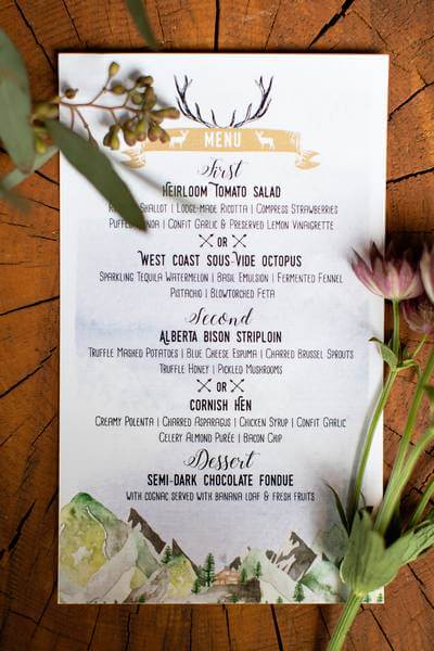
Defining Moments Stationery
Photos Courtesy of Kim Payant Photography
“Choosing your favourite is difficult when you’re blessed with the loveliest of couples, but Kristin and Cameron’s invite suite was this year’s dream come true! What started out as a simple watercolour invitation quickly transformed into this multi-panel gem with so many perfect little details! Once it was printed on linen stock we all swooned. Their super intimate wedding at Storm Mountain Lodge in Banff was truly what fairy tales are made of and one more reason why this one is going down as a milestone for our little paper studio.”
– Olga Loeffen, Defining Moments Stationery
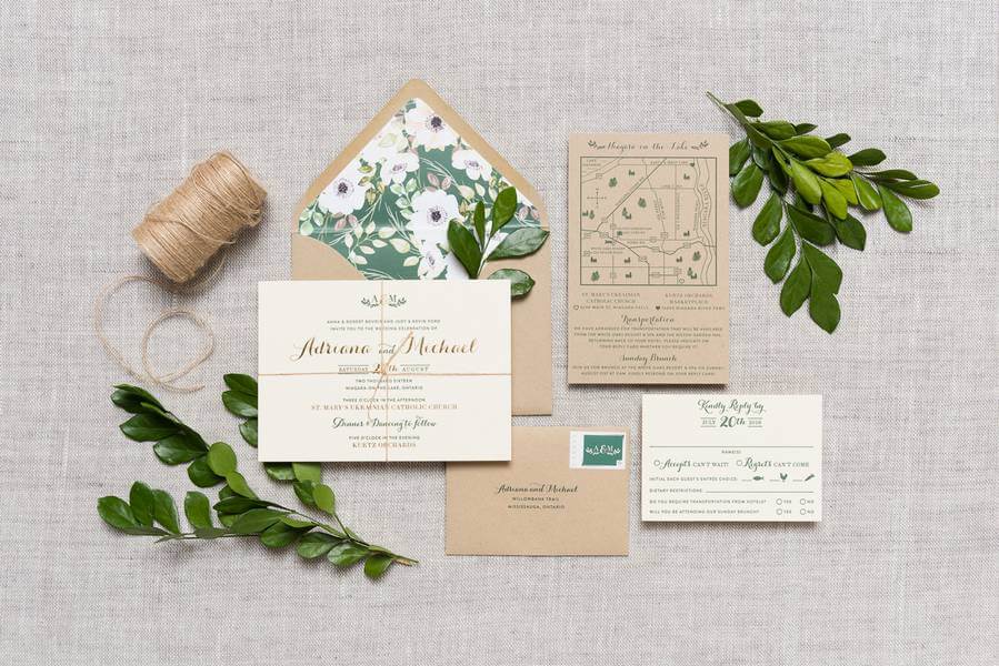
Paper & Poste
Photo Courtesy of 515 Photo Co.
“Adriana & Michael wanted a design that included natural tones and represented the orchard their wedding was held at! The green letterpress and kraft envelopes showcased that, topped off by a floral print envelope liner which really brought nature and the outdoors into the design. Adriana fell in love with metallic Gold Foil so we decided to highlight that on the invitation piece.”
– Beckee Kavanagh, Paper & Poste
Vibrance Designs
Photo Courtesy of Pepper and Light
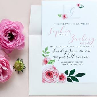
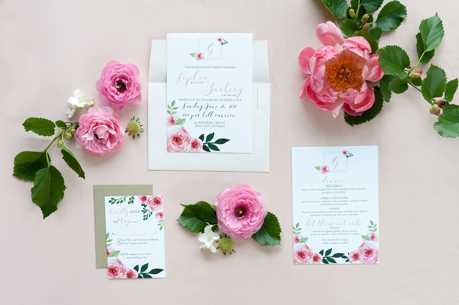
“I love this suite because it’s simple and classic. The focus is on the watercolour hand-painted elements that match the floral arrangement from the table setting of the styled shoot. The invitation itself is printed on our luxury cotton paper, which you can’t see in photographs always, but feels like you’re holding something fit for a queen. Its soft texture adds a rich element to any ink design placed on it. The inspiration for this suite was pretty in pink with a touch of 60’s Italian summer. ”
– Puja Malhotra, Vibrance Designs
Peartree and Clover
Photo Courtesy of Laura May Photography
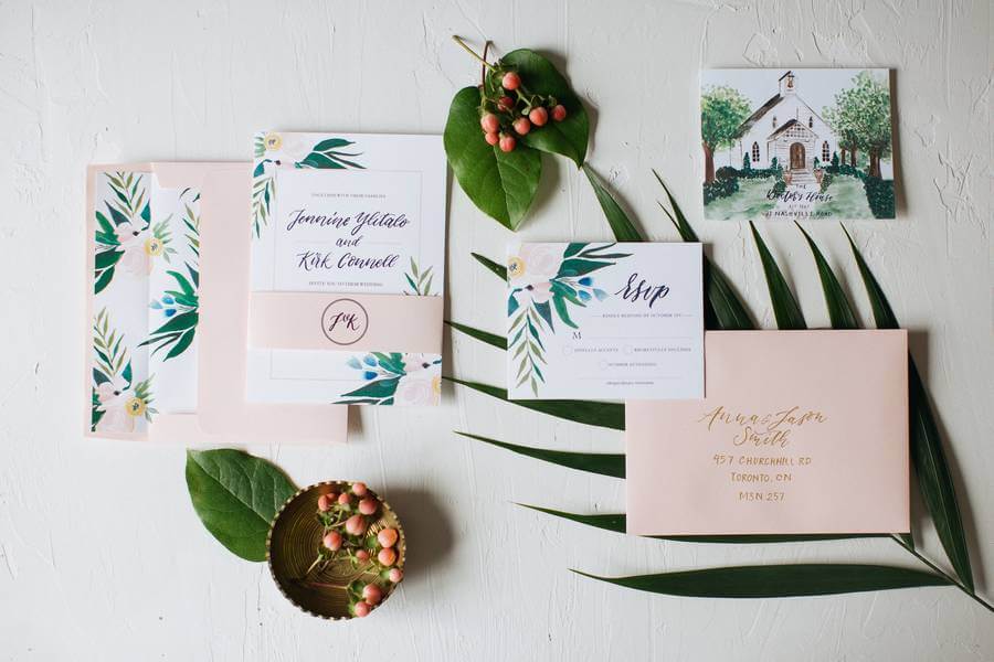
“Each piece of this suite has a hand touched element. The soft palette and watercolour florals set the tone for a modern elegant affair. Every detail was considered from the coordinated envelope liners down to the custom hand painted chapel.”
– Amanda Di Santo, Peartree and Clover
Utility House Design Company
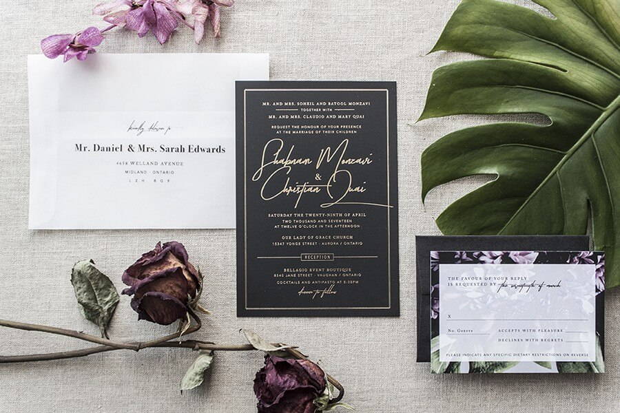
“There’s nothing better than a client who has confident style, an ambitious vision, and trusts you wholeheartedly. In this case, I had the best time combining touches of gold (who doesn’t drool over gold foil), mixed textures (that black suede paper is only really appreciated in hand), and floral hints. Speaking of hints, I’m obsessed with these vellum envelopes that give the guests a sneak peek at what’s inside (note: it’s not a bill to pay!).”
– Melissa Meyer, Utility House Design
RSVP by Whim
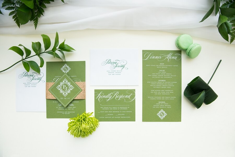
“Our inspiration for the stationery suite came from Pantone’s greenery palette for 2017. We wanted to incorporate fresh greenery with copper tones in a clean modern design to complement the Aga Khan Museum‘s lovely main space with its beautiful high ceilings and sun-drenched atrium. Using this palette of greens, copper and white ink paired well with our table designs, floral detailing and of course the gorgeous marble cake and sweet table.”
– Alisha Chadee, Events by Whim
Brooklin Paper Co.
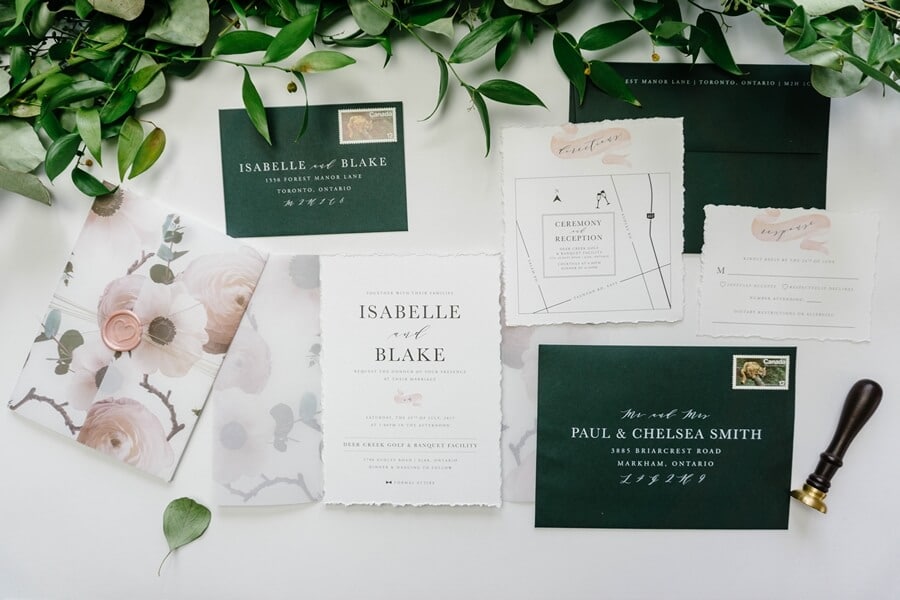
“This is one of our favourite invitations from this year because of the various elements that make it unique. The beautiful printed translucent vellum enclosure combined with the soft hand-torn cotton paper provides many layers of beauty. The combination of a timeless typeface with a few whimsical touches and script font really makes this design stand out. ”
– Vannessa Nguyen, Brooklin Paper Co.
The Polka Dot Paper Shop
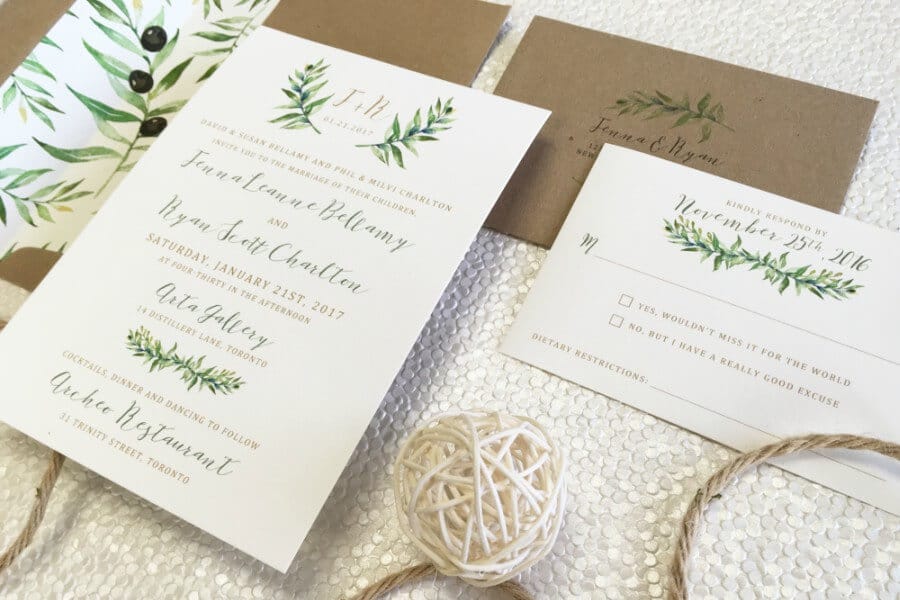
“The biggest themes we saw for 2017 were natural greenery, watercolour designs and a touch of rustic Tuscan elegance. We also noticed a huge trend (thankfully!) towards customers wanting a more sustainable, eco-friendly product. This invitation touches on all of the hottest trends, as it is printed on 100% cotton tree-free stock, with post-consumer recycled paper envelopes and is adorned with a beautiful watercolour olive branch design element that is both fresh and modern.”
– Jenna Wiegand, The Polka Dot Paper Shop
Ferris Wheel Press
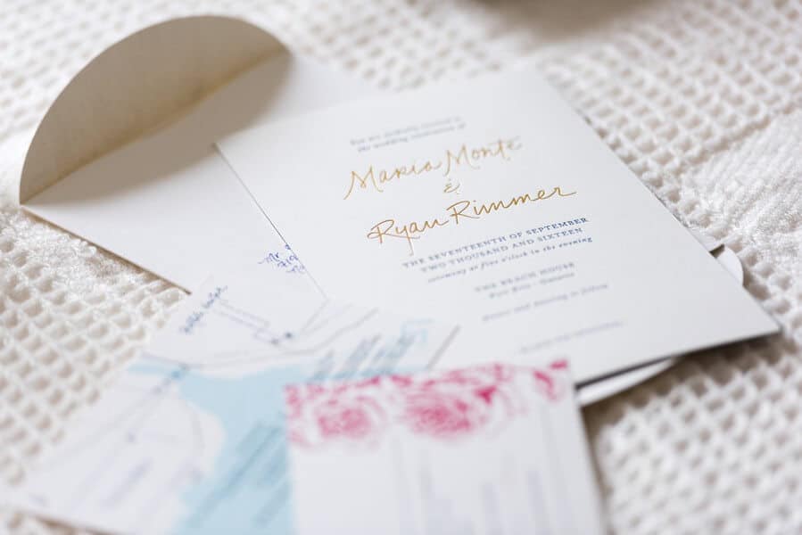
“One of our favourite designs this year come in the form of a modern classic structure, with letterpress printing, gold foil debossed names, vibrant colours, and a tonally printed hand illustrated piece of artwork highlighted with a custom monogram in gold. Presented in a custom handmade envelope that blossoms open, the experience of thoughtfulness and class is elegantly understated and beautifully finessed.”
– Jimmy Yu, Ferris Wheel Press
Kid Icarus
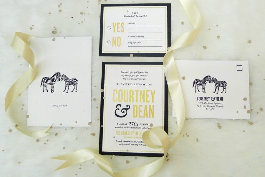
“This groom is originally from South Africa, so the bride wanted to make reference to this with the inclusion of the zebras. We paired metallic gold and black ink to create a bold and stylish wedding suite – definitely one of our faves!”
– Bianca, Kid Icarus
A Good Day Inc.
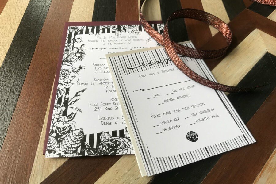
“This design is one of our semi-custom suites – and one of my favourites. We personalized it for the couple and integrated some additional flowers. It’s a modern interpretation of Tim Burton’s Nightmare Before Christmas. The envelopes tied in the secondary colours for the wedding helping set the tone before the event begins.”
– Jordan Kentris, A Good Day, Inc.
Paper Impressions
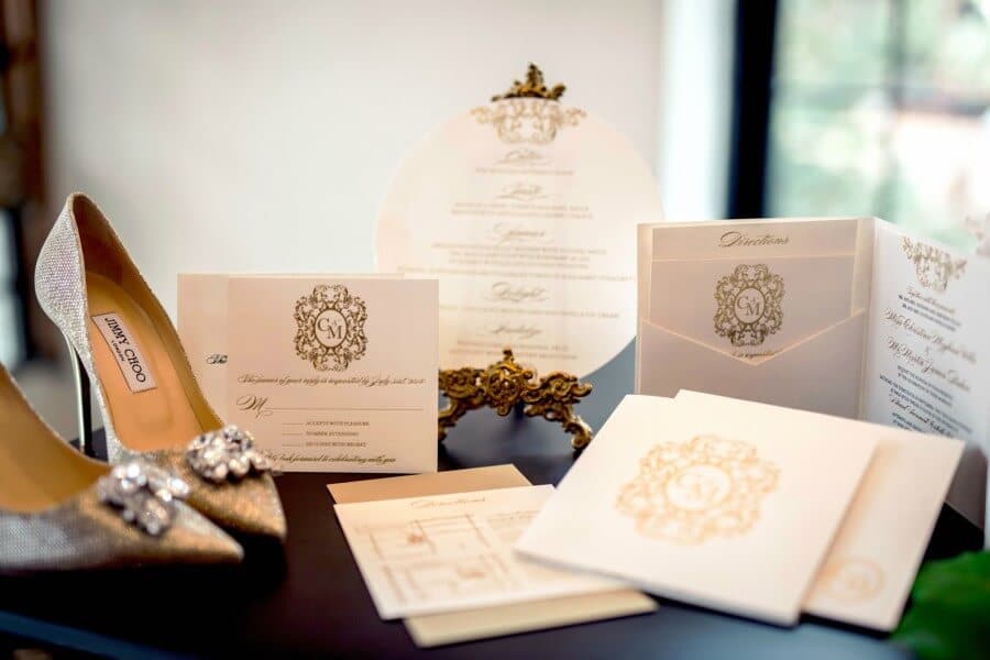
“This invitation is one of our favourite designs as its simple elegance perfectly goes hand in hand with the modern whimsy of this wedding’s garden theme. The intricate monogram design and gold foil pressed finish contrasted on the white stock incorporates the sophistication of iconic designers such as Jimmy Choo as its inspiration.”
– Helen Lim, Paper Impressions Inc.
